Kunstforum Vienna Website-Relaunch
Art against the Internet - a problem solved!
The numerous varied and diverse exhibitions that take place at the Kunstforum Wien on Freyung in the first district of the federal capital are the core asset of the Kunstforum. For this reason, the exhibitions at the Kunstforum have always been the central focus of the website. Previously, echonet had already realized the website of the Kunstforum Wien, which then operated under the name BA-CA-Kunstforum, then BankAustria Kunstforum and now Kunstforum Wien. The website offers numerous special features.

03
2023
Bank Austria Kunstforum
Partner: leisure communications Kommunikationsagentur GmbH
- Project Scope:
- Sector:
- Tools & Products:
- Internationalisation:
Creative artists against Web Agencies
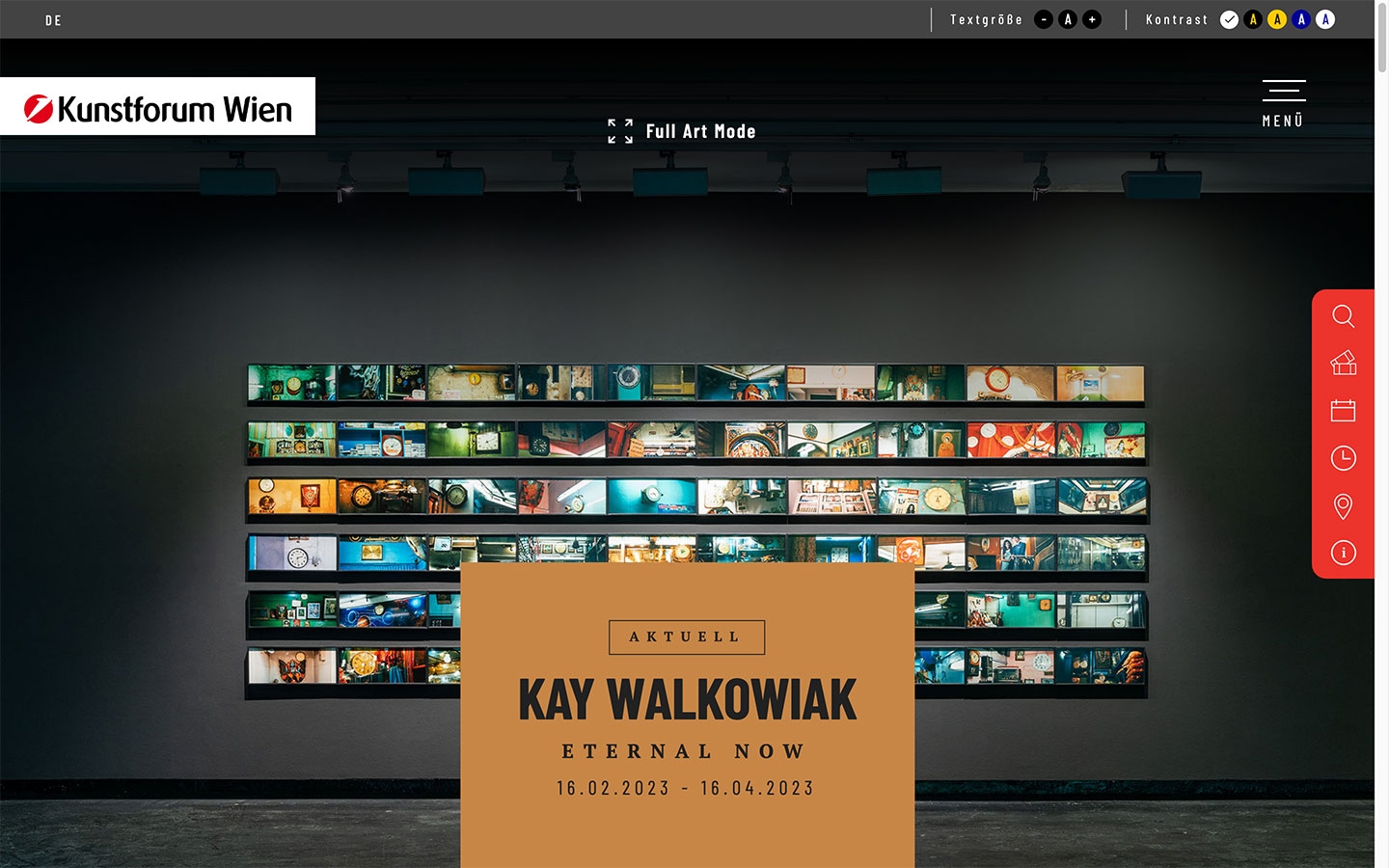
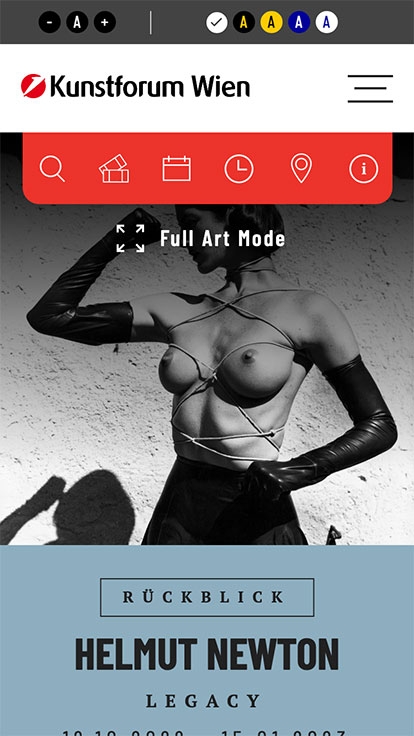
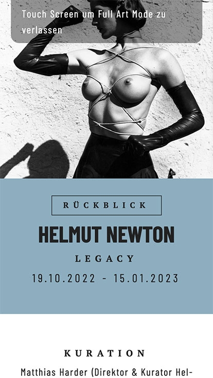
A solution to a difficult problem that arises time and again when creative artists and web design meet. The browser or monitor does not always provide what the art actually wants to communicate. And, even worse for many artists, in order to make a website usable and still have the image in focus, it is often necessary to put something on top of the images or to cover parts of them, as otherwise there would only be an image on the screen without any operating options. To get to grips with this problem, the agency echonet has used a trick for the Kunstforum Wien and now offers a "full art mode" in the header image on the exhibition pages - usually the central artistic element of the exhibition. This allows people using the website to simply free themselves from all disturbing factors on the screen and enjoy the artwork in its full splendor - uncropped, without text or image coverage or inserts. Full Art Mode can be opened separately at the top of the exhibition pages.

Accessibility with full image quality
The topic of "accessibility" was also important in the implementation for the Kunstforum Wien and, because it is so crucial in the visual culture segment that images and photos can also be seen in their original form, echonet once again used the easy2see system, which was developed around 20 years ago together with the Austrian Association for the Blind and Visually Impaired. This makes it possible to experience the text and content in the desired contrast ratio despite the change in contrast on the website - in contrast to many accessibility assistants in the area of operating systems such as Windows or Mac OS - but still see the images - which are so important for the website of an exhibition house or museum - in the original.

Responsive: Optimized for every Device!
Starting at the classic desktop computer, via laptops, tablets and mobile phones including also smart-TV or boardcomputers in cars, we create the website for all these devices. But there is no need anymore to place these "versions" on different URLs. The responsive web design is optimized on one page for all of the devices. That is it when we create responsive web design here with digital handcraft in Vienna.
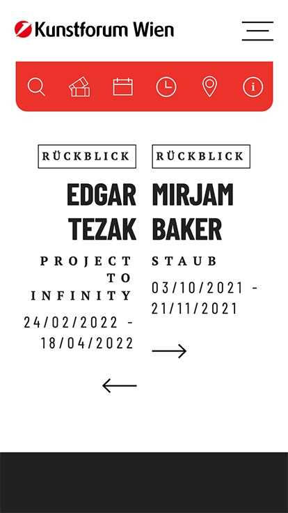
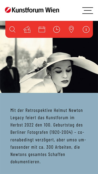
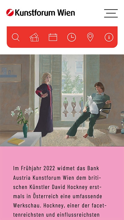
Therefore we define in the design process with our customer together the breakpoints. These are the points, where the layout changes. For example, the text is expanded from 1 to 2 columns, so easier to read. Also, pictures appearing one by one below in mobile phones, the same pictures appear side by side on desktop computers.
E-Commerce and Webshop
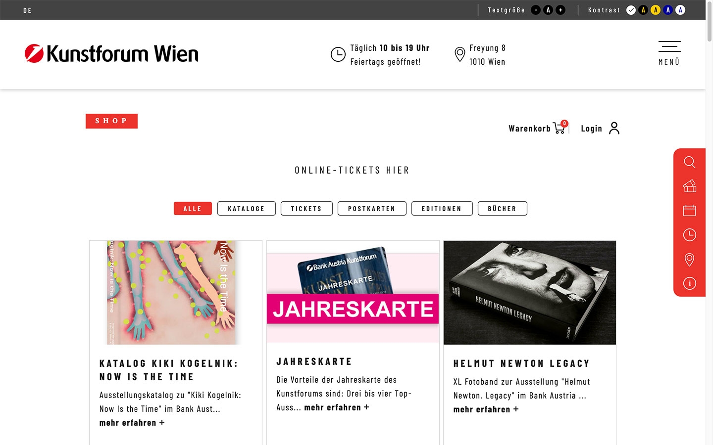
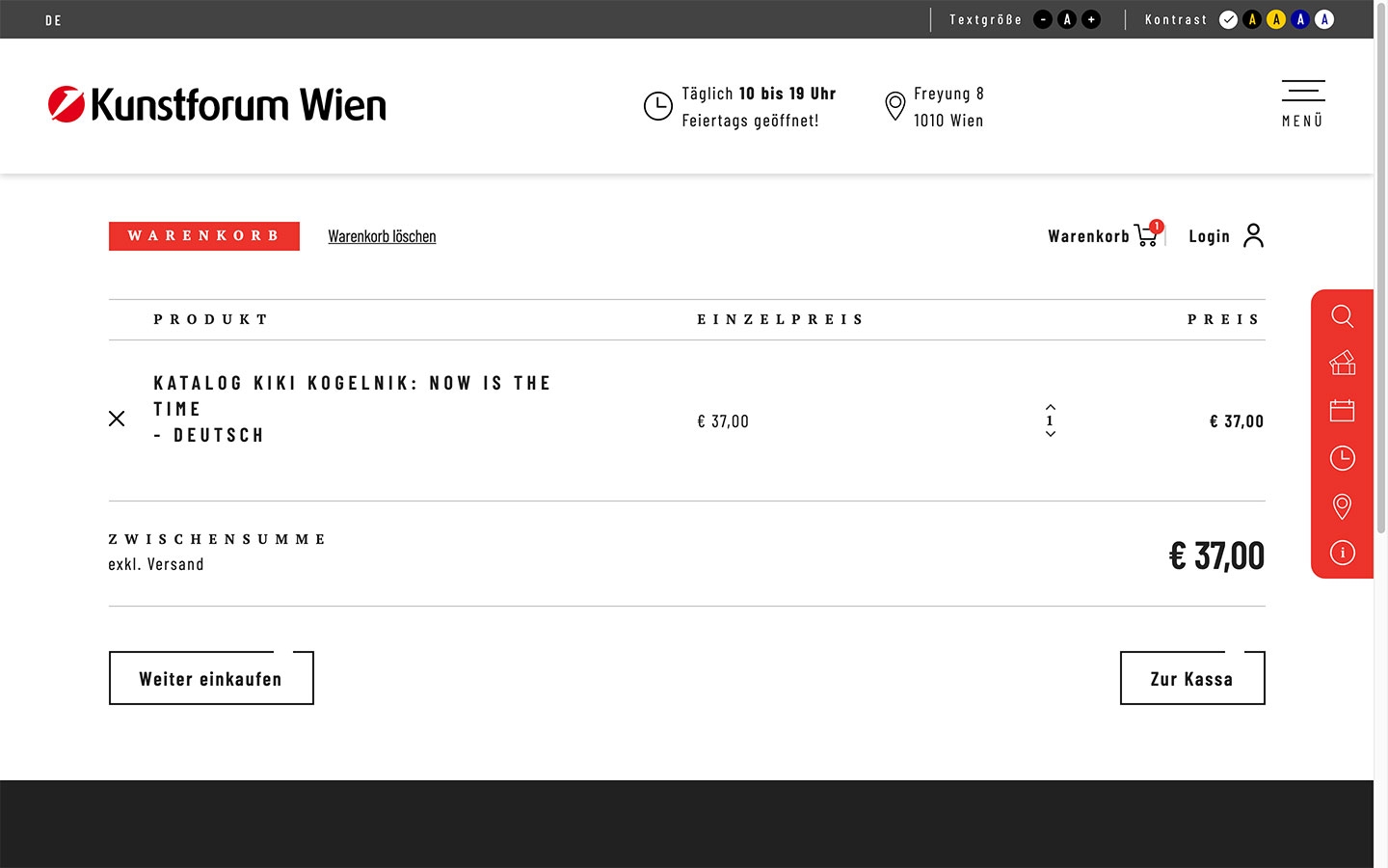
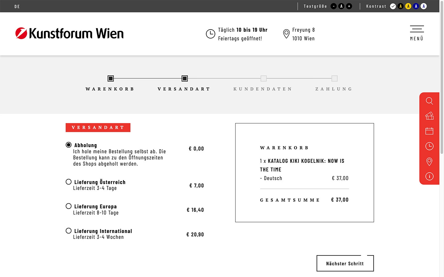
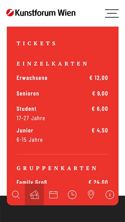
E-commerce is sometimes the core of websites and transaction platforms, in other projects e-commerce is a side project. What e-commerce should always be is an attempt to make contact with people in front of the end device in such a way that they have a positive shopping experience. The idea of echonet in terms of e-commerce is always to focus on the product, on the offer, on the service - just as you would in a normal store. That's why online stores and e-commerce projects like this one at echonet are always designed with the idea of ensuring exactly that.
The handmade web store in this project - built from A to Z, line by line, in-house - is designed to work according to precisely these criteria. Our model for good e-commerce systems is not other good e-commerce systems, but the real world of stores and businesses. The "old economy" provides much more intelligence than many standard systems in digital business. And when we at echonet develop a web store, as in this case, we do so wherever possible in such a way that it follows the idea of a real, physical store. Not with laborious VR design, but with the approach that we develop for e-commerce.
CMS: contentlife 4 »Deep Space«
Version 4 of the content management system contentlife, which echonet has been developing since 1999, was used for this project. contentlife 4 - codenamed "Deep Space" - was developed on the basis of the TWIG (Symphony) template system and was released for the first time in February 2022. The back-end offers a clear content structure, the start page is already a complete dashboard with a complete content list that can be searched directly from there at lightning speed. For different projects, different relevant overview data such as current orders in the online store or marketing data such as newsletter subscriptions or community memberships are displayed immediately in the CMS. The system is equipped with drag & drop technology for file handling with download files and images. The CMS offers a range of new features in the area of search engine optimization compared to content.life 3, the previous version.

